TBD min read
If you could afford to retire (or consider yourself Financially Independent) earlier, wouldn’t you want to know?
I’m pretty risk averse. So, I look at the simple rules some people use to evaluate their ability to walk away from work with a bit of skepticism.
The most commonly touted ways to estimate forward looking financial needs are the 4% rule, from the Trinity Study and the 80% of income guideline, from the BLS Consumer Expenditure Survey. Just so you know I’m not making this up, please take a look at Fidelity’s source for their 80% # here.
Example: I’m a 38 yr old software engineer and single. I’ve saved $750,000 through extreme frugality and a high savings rate. Using the 4% rule, I can safely withdraw $30,000/yr, covering my lifestyle. I am FI and planning to walk away from my full time job soon. Should I?
Maybe. First, pat yourself on the back for being FI now. My hesitation stems from the uncertainty around annual expenses of $30,000. What if you:
- Find a partner
- Have a kid (or more!)
- Get really sick (stupid Covid19)
- Level up your lifestyle
- Simply get old
Any one of these events (and a whole lot more) could result in significant changes to your financial picture. And that’s the point: understanding how your expenses change over our lives can better inform your planning efforts (as a new Dad for the second time, I can say for certain: little girls are expensive).
We set out to build a view of people’s expenses as they move through life. We found the Bureau of Labor Statistics’ Consumer Expenditure Survey and spent some time working to visualize the data to give folks a better idea of the range of expenses that participants in the survey group faced at different times throughout their lives. It is important to note that these are not the same people surveyed at multiple ages; rather, the BLS surveyed lots of people across different ages.
Start by entering an income value and then selecting demographics values. This will filter the dataset to provide the subset of matching folks and automatically update the displays.
Variation matters.
In the output pane, you will first see an income histogram. This shows the shape of the distribution of incomes for the survey participants with the same demographic data. Sometimes people will use an average to represent the center of a distribution. We don’t think this makes sense, especially when we’re trying to understand uncertainty and when the distribution is skewed. We’re displaying where the entered income falls within the distribution of similar folks from the survey. That gives us a percentile, or position in the distribution. (i.e., the 65th percentile is the income where 65% of the other incomes are below it).

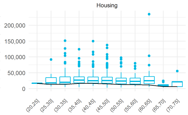
Next, we take the distributions of expenses for all the folks with the same demographics and split them up by age group. We visualize all these distributions using boxplots (if we used histograms, it would be tough to see all the data in a small, useful space). So, think of a boxplot as a dense picture of a distribution.

In this case, each boxplot represents the expense category for one age group. Notice how the shapes of the boxplots change within an expense category for different age groups. We’ve also overlaid a black line that shows the expense percentile over age group based on the income percentile entered as input. Because, it can be tough to see the actual numbers this way, our tool also provides a table of these values.

Check out our app and see if you can reduce some of the uncertainty around your future expenses!

